
Enjoy our Red plans with unlimited calls & texts or get a prepaid card with a handy bundle.
Choose a plan

Top up your credit easily from our website. All you need is a credit card issued in the Czech Republic.
Top up your credit
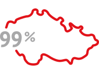
We cover 99% of the Czech population with our 4G LTE Internet. See where and how fast you can connect.
Check coverage


